
We build the brands
clinicians trust
and patients reach for.
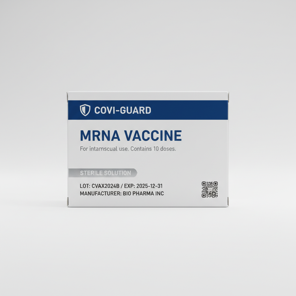
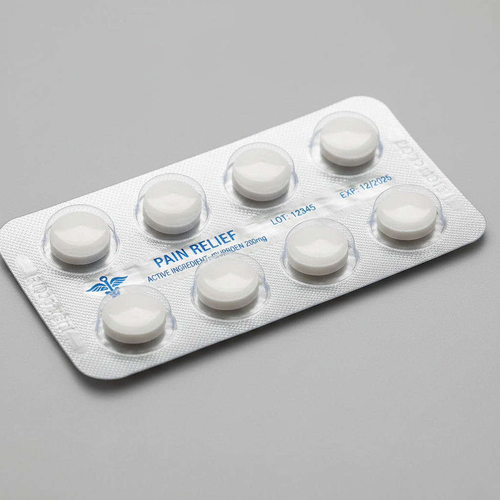
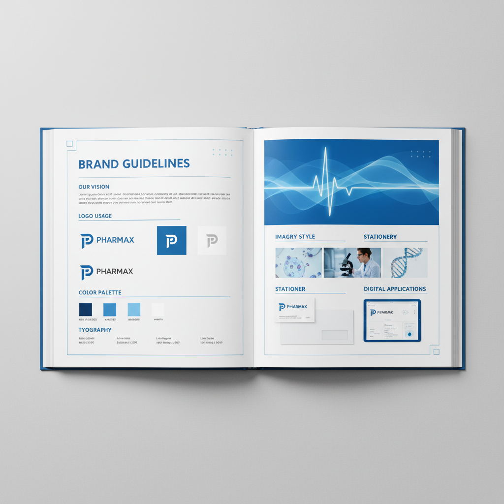
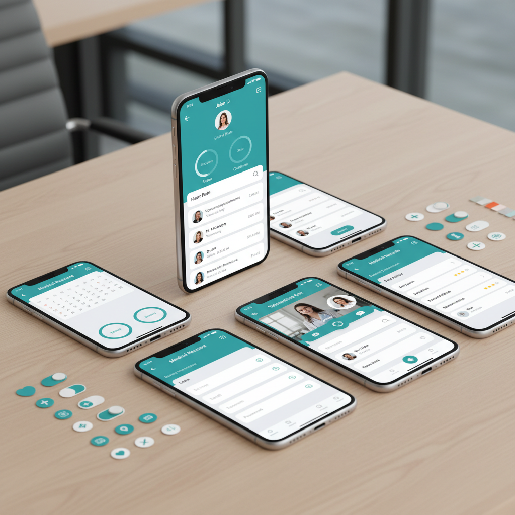
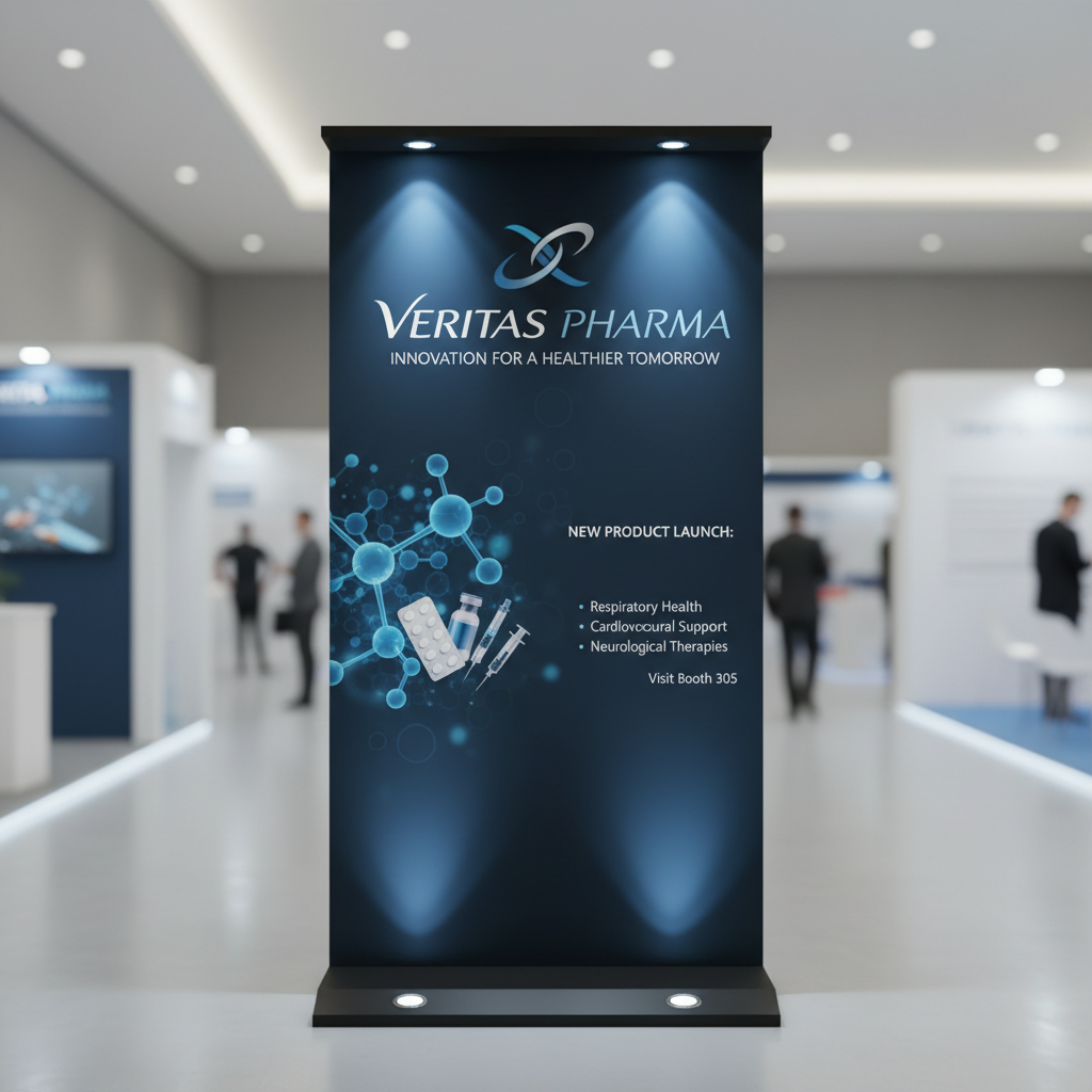
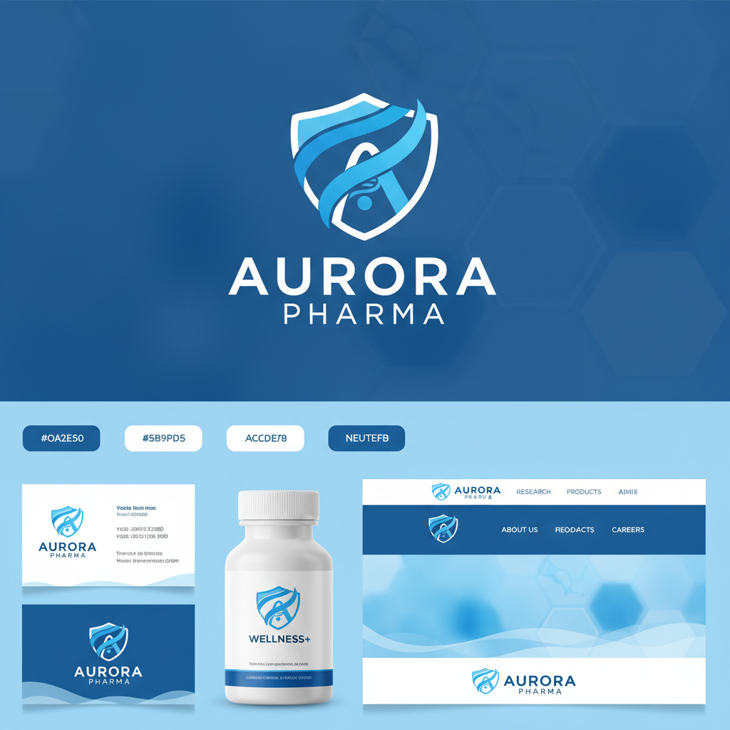
From molecule diagrams reimagined as brand marks to packaging systems that make a pill bottle feel like a promise.
Five stages.
Zero compromise.
Our methodology was built inside pharma, not imported from consumer branding. Every stage accounts for the regulatory reality your brand lives in.
Stage 01
Brand Audit
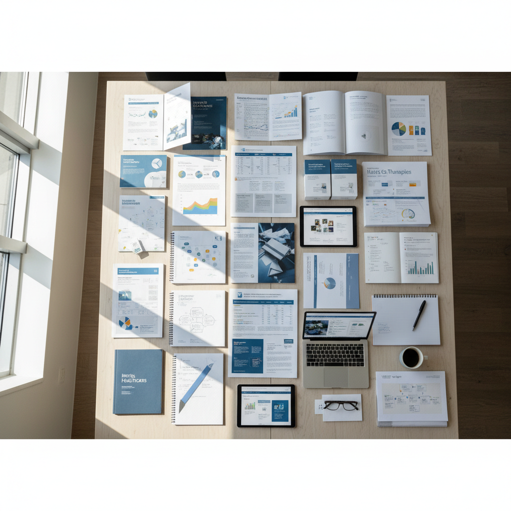
72-point audit framework across 6 brand dimensions
Brand Audit
We dissect every existing touchpoint — packaging, digital, clinical materials, trade presence — against competitor landscapes and HCP perception data. You leave with a gap map no consultant has shown you before.
Naming & Positioning
Visual System
Regulatory Review
Launch Toolkit
Results that appear
in the data.
Three engagements. Three categories. Measurable outcomes that justified the brand investment within the first fiscal year.
Before
After
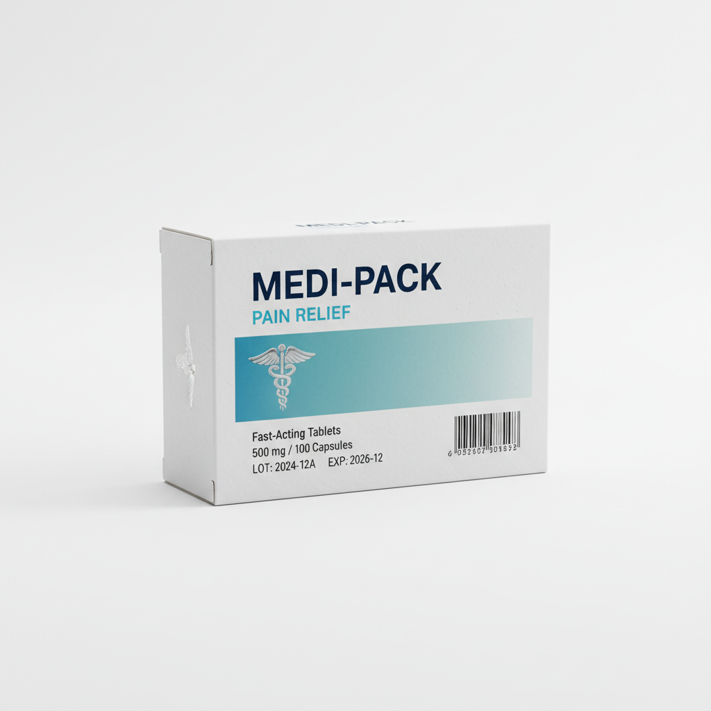
Veralix
The challenge: A mid-cap oncology company launching a biosimilar into a market dominated by the reference product's established brand equity. HCPs had zero reason to switch based on brand alone.
The outcome: Repositioned Veralix as "precision dosing made visible" — a brand built around the clinical workflow benefit, not the molecule. Formulary adoption reached 34% in Q1, exceeding forecast by 2.1×.
34%
Q1 formulary adoption
2.1×
Forecast exceeded
61%
Unaided recall at 90 days
Before
After
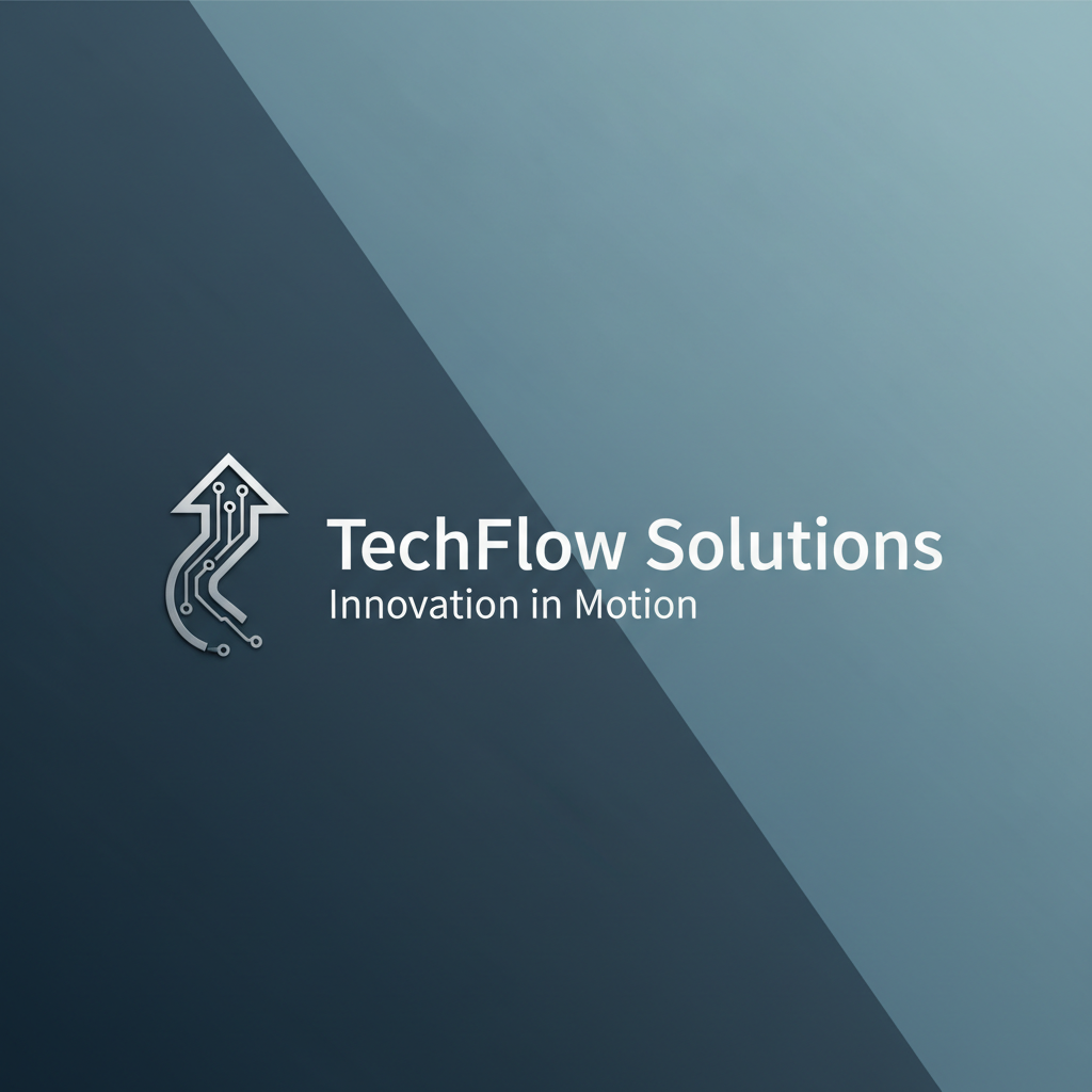
Novalent
The challenge: A Series C biotech preparing for FDA approval needed an investor-facing identity system that could pivot to commercial without a rebrand. The science was validated; the brand was a PowerPoint template.
The outcome: Built a dual-purpose identity: rigorous enough for NDA submission materials, compelling enough for Series D roadshow. Raised $180M at a 40% premium to pre-brand valuation.
$180M
Series D raised
40%
Valuation premium
8 wks
Audit to full identity
Before
After
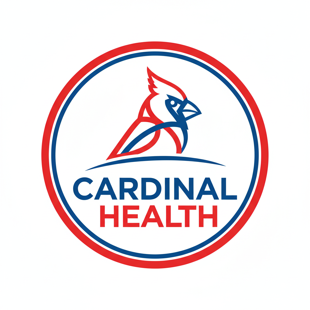
Meridian MedSupply
The challenge: Three regional hospital supply companies merged under private equity. Three logos, three color systems, three cultures — procurement directors couldn't tell who they were buying from.
The outcome: Unified identity across 2,400 SKUs in 14 weeks. New brand architecture reduced procurement confusion, contributing to a 22% increase in contract renewal rates in year one.
2,400
SKUs unified
14 wks
Full system delivery
+22%
Contract renewal lift